Shiny Dashboards
Lecture 19
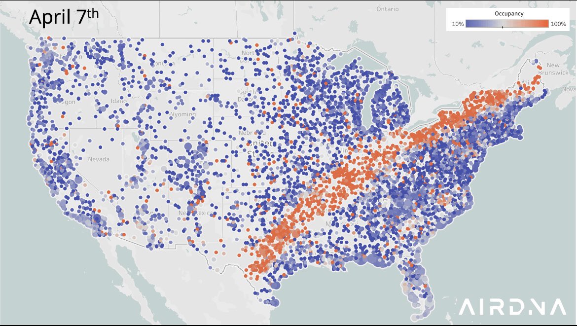
What is visualization about?
Reference
The code for the app can be found here.
# Load packages ----------------------------------------------------------------

library(shiny)
library(tidyverse)
library(ggthemes)
library(scales)
library(bslib)
library(bsicons)

# Load data --------------------------------------------------------------------

manager_survey <- read_rds("data/manager-survey.rds")

# Find all industries ----------------------------------------------------------

industry_choices <- manager_survey |>
  distinct(industry_other) |>
  arrange(industry_other) |>
  pull(industry_other)

# Randomly select 3 industries to start with -----------------------------------

selected_industry_choices <- sample(str_subset(industry_choices, "Other", negate = TRUE), 3)

# Calculate overall average

overall_average <- manager_survey |>
  summarize(mean_salary = round(mean(annual_salary), 0)) |>
  pull(mean_salary) |>
  scales::dollar()

# Define UI --------------------------------------------------------------------

ui <- page_navbar(
  title = "Ask a Manager",
  theme = bs_theme(
    primary = "#0577B1",
    secondary = "#339898",
    info = "#E89923",
    danger = "#C84E00"
  ),
  bg = "#005587",
  sidebar = sidebar(
    selectizeInput(
      inputId = "industry",
      label = "Select up to 8 industies:",
      multiple = TRUE,
      choices = industry_choices,
      selected = selected_industry_choices,
      options = list(plugins = "remove_button")
    )
  ),
  header = layout_columns(
    col_widths = c(3, -1, 3, -1, 3),
    fill = FALSE,
    uiOutput("selected_industries"),
    value_box(
      title = "Average salary for selected industries",
      value = textOutput(outputId = "selected_average"),
      showcase = bs_icon("cash"),
      theme_color = "secondary",
      fill = FALSE,
      height = "150px"
    ),
    value_box(
      title = "Overall average salary",
      value = overall_average,
      showcase = bs_icon("cash-stack"),
      theme_color = "info",
      fill = FALSE,
      height = "150px"
    )
  ),
  nav_spacer(),
  nav_panel(
    title = "Average salaries",
    card(
      card_body(
        plotOutput(outputId = "avg_salary_plot")
      )
    )
  ),
  nav_panel(
    title = "Individual salaries",
    layout_columns(
      col_widths = c(12, 8, 4),
      conditionalPanel(
        condition = "input.industry.length <= 8",
        card(
          card_header("Zoom in to salaries between"),
          card_body(
            sliderInput(
              inputId = "ylim",
              label = "",
              min = 0,
              value = c(0, 1000000),
              max = max(manager_survey$annual_salary),
              width = "100%"
            )
          )
        )
      ),
      card(
        card_body(
          plotOutput(outputId = "indiv_salary_plot", brush = "indiv_salary_brush")
        )
      ),
      card(
        card_body(
          tableOutput(outputId = "indiv_salary_table")
        )
      )
    )
  ),
  nav_panel(
    "Data",
    card(card_body(DT::dataTableOutput(outputId = "data")))
  ),
  footer = p("Showing only results for those with salaries in USD who have provided information on their industry and highest level of education completed.")
)

# Define server function -------------------------------------------------------

server <- function(input, output, session) {
  # Number of selected industries
  output$selected_industries <- renderUI({
    value_box(
      title = "Number of selected industries",
      value = length(input$industry),
      showcase = if_else(length(input$industry) <= 8, bs_icon("check"), bs_icon("x-octagon")),
      theme_color = if_else(length(input$industry) <= 8, "primary", "danger"),
      fill = FALSE,
      height = "150px"
    )
  })

  # Filter data for selected industries
  manager_survey_filtered <- reactive({
    manager_survey |>
      filter(industry_other %in% input$industry)
  })

  # Selected average
  output$selected_average <- renderText({
    manager_survey_filtered() |>
      summarize(mean_salary = round(mean(annual_salary), 0)) |>
      pull(mean_salary) |>
      scales::dollar()
  })

  # Make a table of filtered data
  output$data <- DT::renderDataTable({
    manager_survey_filtered() |>
      select(
        industry,
        job_title,
        annual_salary,
        other_monetary_comp,
        country,
        overall_years_of_professional_experience,
        years_of_experience_in_field,
        highest_level_of_education_completed,
        gender,
        race
      )
  })

  # Futher filter for salary range
  observeEvent(input$industry, {
    updateSliderInput(
      inputId = "ylim",
      min = min(manager_survey_filtered()$annual_salary),
      max = max(manager_survey_filtered()$annual_salary),
      value = c(
        min(manager_survey_filtered()$annual_salary),
        max(manager_survey_filtered()$annual_salary)
      )
    )
  })

  # Plot of jittered salaries from filtered data
  output$indiv_salary_plot <- renderPlot({
    validate(
      need(length(input$industry) <= 8, "Please select a maxiumum of 8 industries.")
    )

    ggplot(
      manager_survey_filtered(),
      aes(
        x = highest_level_of_education_completed,
        y = annual_salary,
        color = industry
      )
    ) +
      geom_jitter(size = 2, alpha = 0.6) +
      theme_minimal(base_size = 18) +
      scale_color_colorblind(labels = label_wrap_gen(20)) +
      scale_x_discrete(labels = label_wrap_gen(10)) +
      scale_y_continuous(
        limits = input$ylim,
        labels = label_dollar()
      ) +
      labs(
        x = "Highest level of education completed",
        y = "Annual salary",
        color = "Industry"
      )
  })

  # Linked brushing
  output$indiv_salary_table <- renderTable(
    {
      validate(
        need(length(input$industry) <= 8, "Please select a maxiumum of 8 industries.")
      )

      brushedPoints(manager_survey_filtered(), input$indiv_salary_brush) |>
        select(industry, highest_level_of_education_completed, annual_salary) |>
        rename(
          Industry = industry,
          Education = highest_level_of_education_completed,
          Salary = annual_salary
        )
    },
    digits = 0
  )

  # Plot of average salaries from filtered data
  output$avg_salary_plot <- renderPlot({
    validate(
      need(length(input$industry) <= 8, "Please select a maxiumum of 8 industries.")
    )

    manager_survey_filtered() |>
      group_by(industry, highest_level_of_education_completed) |>
      summarise(
        mean_annual_salary = mean(annual_salary, na.rm = TRUE),
        .groups = "drop"
      ) |>
      ggplot(aes(
        x = highest_level_of_education_completed,
        y = mean_annual_salary,
        group = industry,
        color = industry
      )) +
      geom_line(linewidth = 1.5) +
      theme_minimal(base_size = 18) +
      scale_color_colorblind(labels = label_wrap_gen(20)) +
      scale_x_discrete(labels = label_wrap_gen(10)) +
      scale_y_continuous(labels = label_dollar()) +
      labs(
        x = "Highest level of education completed",
        y = "Mean annual salary",
        color = "Industry"
      )
  })
}


# Create the Shiny app object --------------------------------------------------

shinyApp(ui = ui, server = server)![]()